

How to Improve User Experience, Customer Engagement, and Retention in Digital Products
It is a well-known scenario: you see a new digital product that looks incredibly promising and worth your time, but once you try it out, nothing really keeps you there. So right after the first session, you switch to something else.
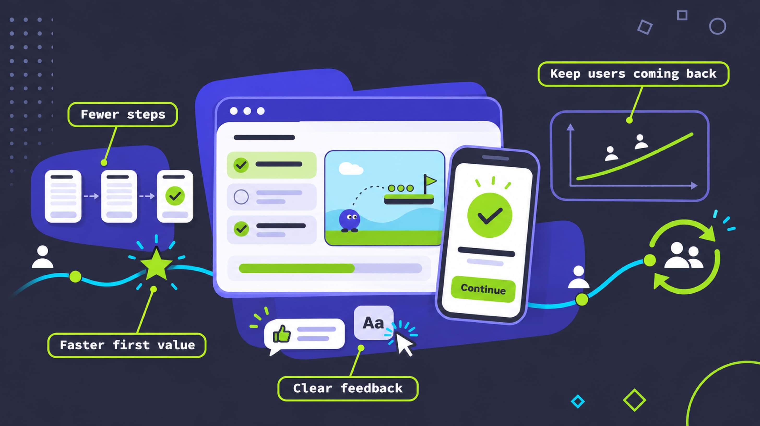
A strong product experience is capable of changing this pattern. Users adopt a product when they understand what it does for them and, what is even more important, can get that result with little effort. But if you add unnecessarily demanding workflows, complicated and confusing onboarding or bad UX and UI, people are likely to just quit the product. All of that delays the value, making it harder to discover.
You can fix that with four steps: start with an audit, find what creates an issue, work to fix it, and document it.
UX consulting and product optimization allow you to gain an outside perspective on your product. At Fgfactory, we analyze business processes, user journeys, interfaces and engagement mechanics together. Our background in game development and custom software gives us hands-on experience with tutorials, progression systems and complex workflows, and that is exactly what digital product UX needs. The goal of every review is a set of improvements the team can act on.
Key Takeaways
- Users leave a product early because they face onboarding issues and core workflows that delay the discovery of product value.
- A UX audit allows product teams to look at workflows, user journeys and interface design, and decide whether they fit their business goals.
- Fewer steps and easy but efficient onboarding that leads toward real results are a must, as they are also a way to increase user engagement.
- Engagement that really lasts depends on the value users get each time.
- Measure before and after every change and document it, because that’s how you get the full picture of how many users start, finish or easily use the most important features, and whether they come back.
- Fgfactory reviews your product, shows which problems matter most and helps you change it for the better.
Importance of User Experience Optimization for Digital Products
User experience is essential because it makes people want to keep using your product. Moreover, it is the main factor in how quickly they understand it.
User experience optimization helps you find where people have problems when going through your product and where you need to change it to make it better. There’s no particular section where things can go wrong, as problems can equally relate to performance or screens.
Adoption depends on it at every single stage. The first time users try your product, anything off can make them bounce. Satisfaction, just like in games, comes from the fact that users can pass a few tasks without errors or having to start over. And that creates engagement, too.
User experience optimization and customer experience optimization may sometimes overlap and cover similar areas, but they are not the same thing. UX is for the product, and it works with screens and flows. Customer experience includes every single contact a person has with the company, so it can even include sales or billing.
Customer experience optimization is the core of a product’s longevity: people tend to spend a lot of time in truly useful apps, and if nothing changes, the product is likely to lose its user base.
In software user experience, some features can be too complex to follow, but it is not the same for mobile apps, where everything is done on a different scale. Ensuring a quality gaming experience is probably the hardest, as this audience is often the most demanding.
Problems that Affect User Engagement and Retention
Before you start changing things because engagement is low, you need to look closely at user behavior. The reasons for drop-offs are never esoteric or strange; they are in fact rooted in your own product, and people just react to it.
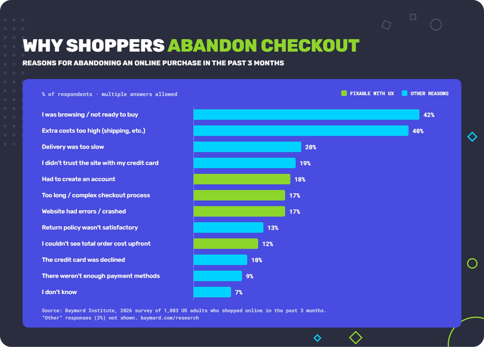
Apart from rather neutral reasons (too expensive, not ready to buy) people most often abandon digital products due to long onboarding and checkout.
Once you check what exactly makes people quit, whether these are flaws in UX or in workflows, you can start making changes based on real data. If you start redesigning blindly, without evidence that a particular thing does not work, you might miss the main issue.
Tip: If you see that people tend to drop off at one step of your funnel, take a closer look at five or even ten session recordings of people who left at that point. You will see the pattern that makes them quit.
But what should you look into when it comes to customer experience optimization? The most common warnings are onboarding abandonment and incomplete user journeys. If your problem is there, then people stop before they complete your tutorial, and that’s where you need to fix things.
Sometimes the product shows errors when the user did nothing wrong. It kills user experience right away and undermines trust in your product. Moreover, teams might be working on a set of features they consider central to the product, but those features actually stay underused. Another question worth checking is why initially stable activity slows down over time.
All these things show you that something is wrong, but they don’t say why. That’s why you need to research. Better yet, a mix of research. If you start with product analytics and usability testing, you can see where exactly people stop using your product and how they abandon certain tasks.
Conduct user interviews to find out what people expect from your product or from a good product in your niche. Customer feedback might point to something you had no idea people found frustrating.
Finally, your own team can give you a wealth of data when sales, support and customer success share the complaints they hear. Developers can also provide a report on the systems that are most likely to break. If you manage to hear every important role in your team and take into account what they say, the product will definitely improve.
Audit an Existing Digital Product
A product audit is where you can see how people get the most important things done. It does not have to be anything too hard. Simple actions like signing up, creating a first project, or inviting a teammate are extremely important and can give you insights to act on later. Then go through each one step by step, once as a new user and once as a regular user, and note every spot that seems to be even slightly dubious.
What you need overall is an assessment of core workflows and whether they make sense at all. Navigation and how it works are vital, but so is feature usage. People expect to find the most important features in a visible place or at least consider them easily accessible, so make sure your vision and that of your users are the same.
Some issues might seem minor, especially if most of your individual interface elements work excellently. But if you add unnecessary steps or some actions get duplicated, that already affects the user experience. Not to mention processes that were badly connected or even misleading.
The last thing to check is whether your processes match what the product promises. If you promise a quick setup but your product requires a call or a number of long steps to activate the account, obviously the promise has failed. This is common in software user experience, because over the years features might just pile up. However, during product optimization, you can see all those things and fix them.
Analyze User Journeys and Identify Friction Points
User journey mapping means drawing out the path people take: their first contact with the product, the main tasks and their later visits. A journey map is actually a map of the user’s actions, expectations and the points where they face obstacles. If it is based on real data, the journey can be easy, smooth and welcoming for new users.
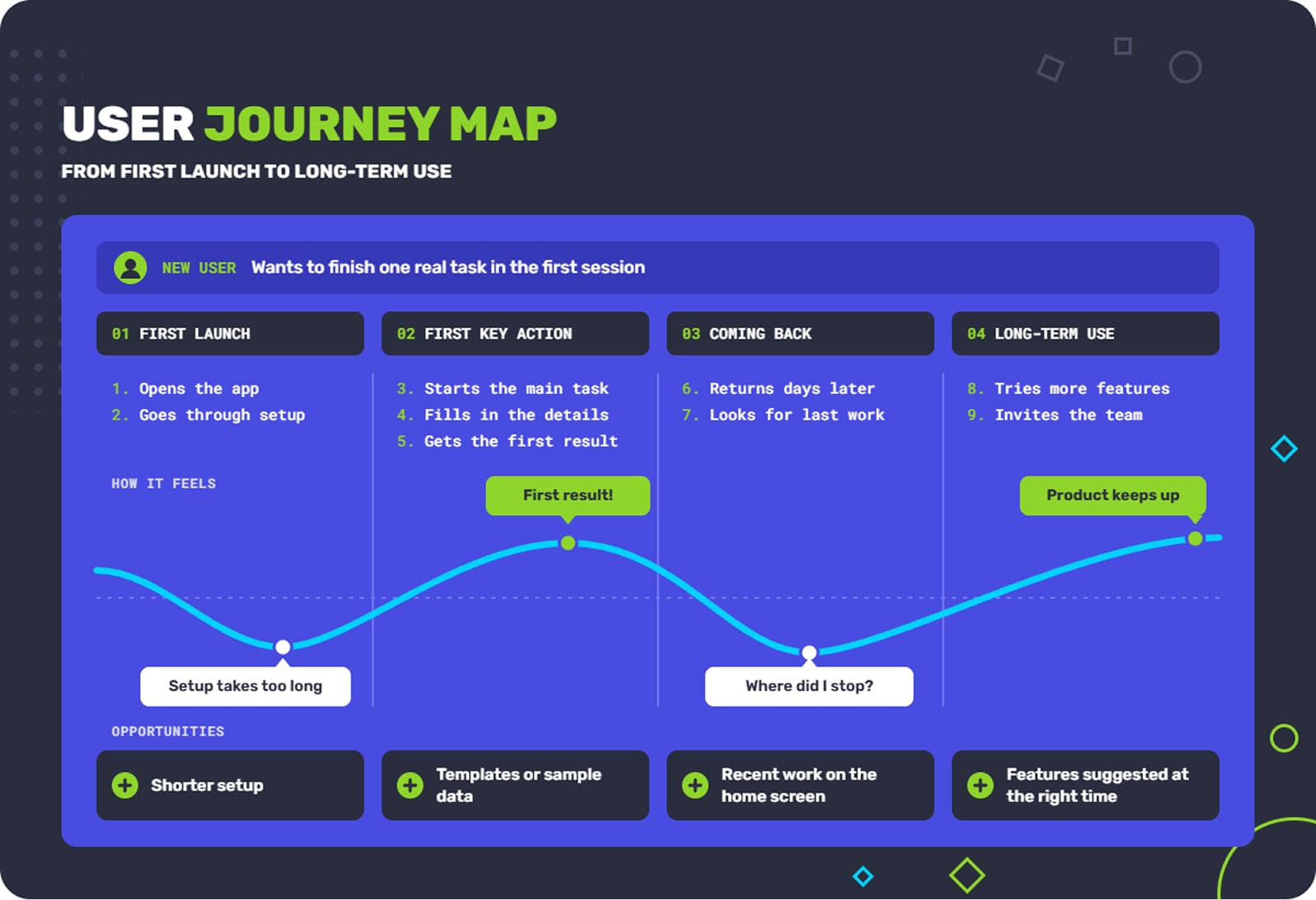
You can think about the user journey in four stages:
- First launch and onboarding. It isn’t clear what the product does, or setup takes too long.
- First key action. The user can’t complete the main task.
- Coming back. Nothing brings them back, or they can’t find where they left off.
- Long-term use. Their needs grow, and the product doesn’t keep up.
This is also a very simple, technical way to increase user engagement. Once you map these stages, weak spots are easy to see. A common one is a flow that ends on a blank screen with no next step. Others are an email confirmation step that loses half of new users, or a milestone people reach without the product ever telling them. User journey mapping also tells you what to fix first. There’s no point polishing advanced features if most people never get past day one.
| Problem | Example |
|---|---|
| Poorly designed onboarding | A project tool shows eight tips in a row before you can create a single task. |
| Inefficient navigation | A banking app puts card limits under “Profile” instead of “Cards”, so people can’t find them. |
| Crowded screens | A mobile game’s main menu shows offers, events, mail and four currencies at once, and the “Play” button gets lost. |
| Slow or unclear flows | A file finishes uploading with no confirmation, so people upload it twice. |
| Inconsistent design | The “Save” button is blue on one screen and grey on another, so people think it’s disabled. |
User journey optimization comes out of the map. Remove everything that does not help users proceed easily and discover your app more smoothly.
Review UI/UX Designs, Wireframes and Usability
A lot of usability problems are easy to see through design. If you analyze wireframes and mockups, you can already see what choices make the experience harder for users. Do this before your product is live, because you can still change a lot without paying much.
When you make the review, check whether content is grouped the way people expect. The most important action on each screen should be very easy to take, almost effortless and intuitive. Also, every time a user takes an action, it should be obvious what just happened and where it leads.
Lastly, design should be tailored to your audience. If you put a lot of objects on the screens, it might work for analysts, but if you are creating a reading-related environment, it is just wrong to make it look messy. If audience needs in design are met, layout and visual changes improve user experience, and you can easily see the proof of that.
Analyze Engagement Mechanics and Retention Barriers
If you think about engagement in the current market, you’ll see it as one of the main drivers of people returning to the product. A lot depends on engagement when it comes to interaction with a product, any product in fact.
Onboarding flows, progressions, rewards, and other relevant engagement features make people more involved in the product. This does not mean they only work for games; these are general engagement solutions, and they are just as effective for other types of products.
When analyzing engagement mechanics, what you need to do is try to determine whether they allow people to get real use out of the product. A setup progress bar is a great gamification mechanic and engagement device, but it also has to point to something real. In other words, there should be real progress toward a working account.

The main engagement mechanic Duolingo implemented is gamification.
But if you add more steps or send more notifications than needed, you’re not bringing real value. Even good mechanics sometimes fail. Duolingo’s streaks got people practicing every day, but losing a long streak was too frustrating, which led to some learners quitting. That’s why the Duolingo team added ways to protect a streak.
People often don’t come back to a product they just tried because the first session was not memorable enough, or the home screen doesn’t show where they left off, so they have to start over. Each reason for each different product needs a different solution, and app user retention, as practice shows, might have two or three different ones.
How to Improve UX in Software, Apps, and Gaming Projects
When you apply UX optimization, all your findings in the audit phase can change the product altogether. You go through several phases: apart from the audit, there are analysis, recommendations and implementation. The audit is there to uncover the problems and then analyze them. Recommendations say what to change and why, and finally you implement all the changes.
However, UX optimization is not something you can do just once and forget; rather, it is a process that runs in parallel with your product.
The right changes have to be in line with your product and business type. A B2B platform that trained staff use all day needs speed and a lot of information on screen, but a game has to teach its rules and still be fun, or at least stay engaging.
So any answer to the question of how to improve user experience starts with these differences, because something that works in one product can be absolutely out of place in another. User experience optimization works best when it takes this into account.
Make Core Workflows Simple and Remove Unnecessary Friction
You can start with a kind of manual approach and count the number of steps each task requires. Treat them as points where users either proceed or hesitate and quit. It is a good move to merge screens and avoid adding any unnecessary fields that might make users leave.
Next, look at navigation. One of the best approaches is to group features the way users describe their tasks. Use labels that say what you get, like “Create invoice”, instead of internal names. Everything should be easy enough that one tap can lead to the next important step. That is the essence of UX optimization.
The most important actions do not demand complex movements – they should be very easy to make. The main button on each screen should look like the main button, and other button labels should directly say what is about to happen when you tap them. And if an error appears, show how to fix it quickly.
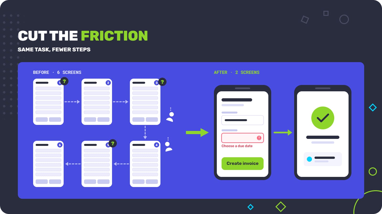
If you give users a simple workflow, it won’t make your product worse; it will make it easier to use, and fewer mistakes will happen. Support gets fewer tickets because users do not get stuck. Changes like this optimize user experience for new and experienced users at the same time, and they are cheap to make. Besides, that’s the fastest way to improve user experience and see it working.
Improve Onboarding and Time to Action
When people think about onboarding, they often perceive it as something very complex, almost like a detailed product tour. In fact, all you have to do is show new users what the product does for them and get them there fast.
The best approach is to introduce features when people need them. If you show them as a preview, it is easy to glance at them and forget by the time they are actually needed.
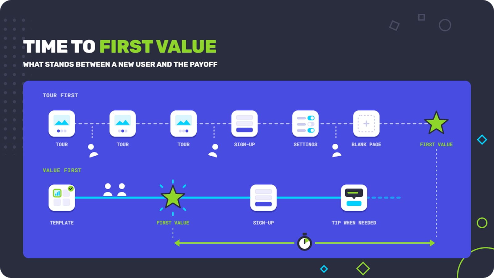
Did You Know? Duolingo once decided to delay sign-in, moving that screen a few steps further into the app, so new users could try a lesson without creating an account. Such a simple but unique step increased the number of active users by about 20%.
The idea to hold onto is the first value moment. This is where the user gets what the product promised, and the sooner it happens, the better for you. People who don’t get there in the first session often never return.
To get people there faster, pick one first value moment for each main type of user and plan onboarding backwards from it. Ask only for what you need to deliver that first result. Offer sample data or templates so nobody starts with a blank page. This is now standard in good app user experience, and it works just as well for SaaS user experience, where the first week of a trial often decides the sale.
Improve User Experience Across Key Touchpoints
When you release your product into the world, people do the same few things again and again: signing up, moving around, searching, finding features and doing the tasks they repeat every week.
So it is important to check every single one of them and make sure they do not ask for much. Moreover, look for purely technical mistakes like typos or grammar errors. This is still a huge part of app user experience.
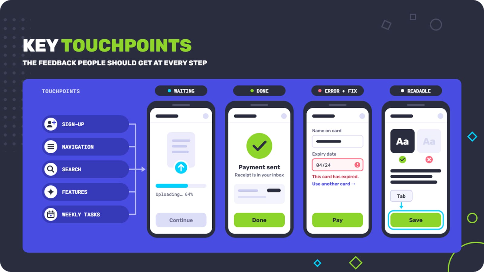
At each of these points, the product should behave the same way and keep people informed. If something takes longer than instant, put a loading bar there, or something else that shows the user needs to wait for a bit.
Confirm finished actions, especially ones that matter, like payments or deletions. Make errors specific and easy to recover from, because this will bring frustration practically down to zero.
Accessibility should also be a part of this, and by that we mean simple things like good color contrast, readable text, keyboard navigation, etc.
Did You Know? The 2026 WebAIM Million report found detectable WCAG failures on 95.9% of the top one million home pages. Low-contrast text alone appeared on 83.9% of them.
Optimize UX and User Engagement
Games need good UX as much as business software, but interestingly, players are not very patient, and far less patient than users of other products. And that’s why, on average, games lose a bigger share of their audience than other products.
Optimize tutorials to allow people to understand the game naturally and gradually, when it makes sense – step by step. As a part of it, check controls, progress and feedback. Controls should follow the platform’s usual patterns and respond very quickly, and players should always know what they’re working toward and how far they’ve come. Sound, animation and numbers should confirm every important action. A clear bar toward the next unlock gives players a small goal in every session.
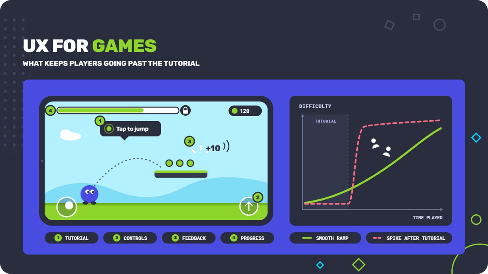
You can have great content, but even a few confusing rules, like a big jump in difficulty right after the tutorial, can easily undermine its value. But if you check whether such things stand in the way and work on them, you can easily improve user engagement in a game.
Fgfactory has been making games for mobile, web and desktop since 2010, including casual, educational and promotional titles. We’ve built and shipped tutorials, game interfaces and progress systems ourselves, and that helps when we review someone else’s.
The same experience carries over to gamified apps, which use game features to increase user engagement outside of games.
Align Your Product Features with User Needs
Few things hurt your product more than features nobody uses. And if you look at usage data, you’ll see which features people find too complex or simply don’t know why they are there. Interviews and usability tests tell these cases apart, and the solution will differ depending on the product.
In many cases, all you have to do is improve what you already have. There is no need to add new features, because they always compete for attention with everything already there.
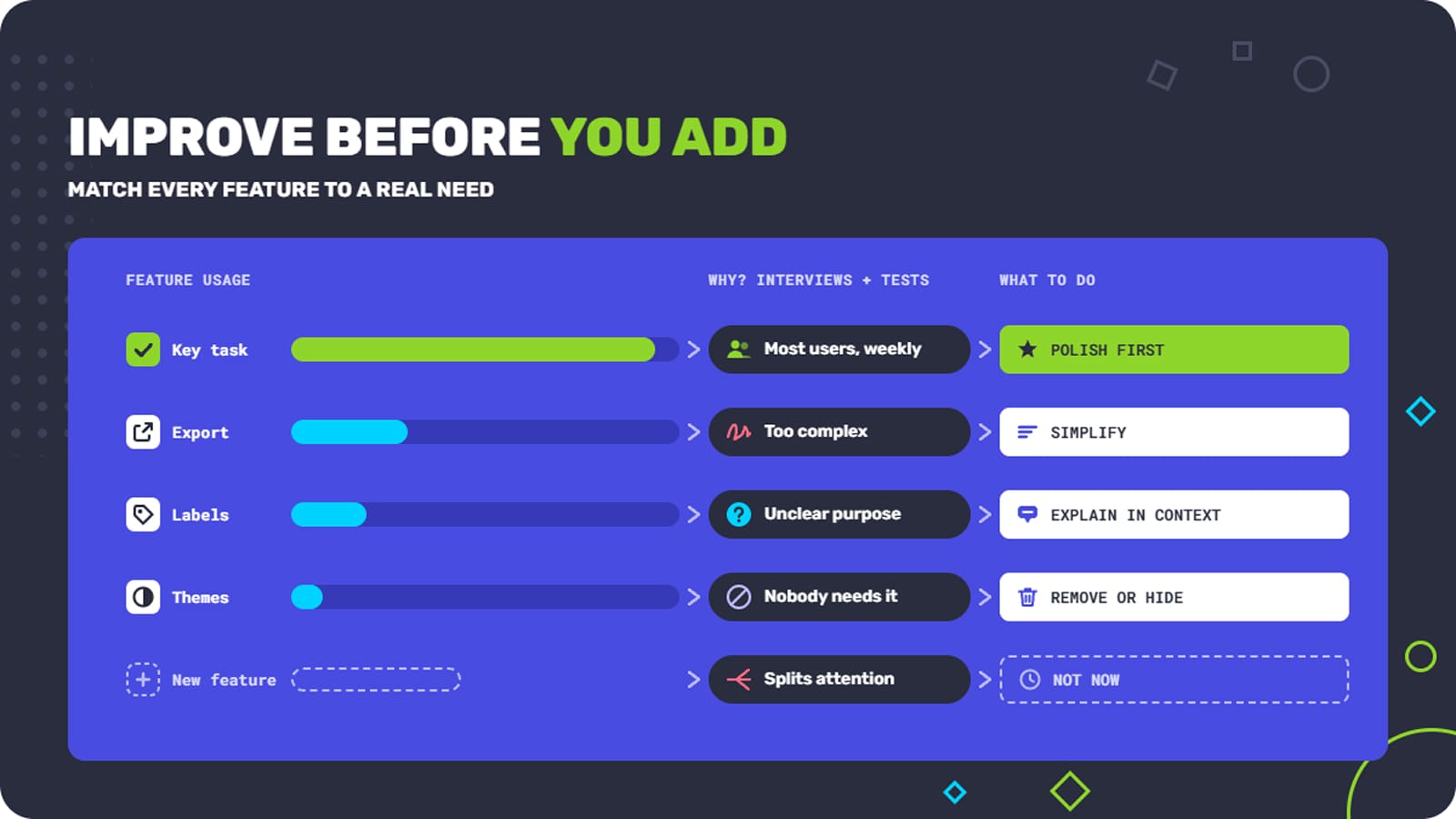
When you decide what to work on, focus first on the benefit to users and the value to the business. A change to a key task that most users perform, and that’s cheap to build, should be first on your list. The point of product optimization is a product that’s more useful and easier to understand. A longer feature list, even though it sounds promising, doesn’t get you there.
How to Increase Customer Engagement and Improve Retention
If you want to make sure engagement is sustainable, what you need is value. And it has to be ongoing. Very often products just add a lot of notifications, rewards, and promotional messages. Of course, this can still support engagement for a short period of time, but if your product experience is bad, no amount of creative notifications can help.
The rule is quite simple: if the usability is fine and the user journey is logical, the interactions will be better, and there will be more returns.
Make Valuable Features More Visible and Easy to Use
People often miss useful features just because they were placed badly or are disconnected from their real functions. What can you do to change that?
- Name menu items the way your users talk. Internal feature names usually mean nothing to them.
- Add a one-line tip next to a feature that says what it does. Show it once.
- Suggest a feature at the right moment. If someone does the same thing by hand five times, offer to automate it.
- Put recent items and saved views on the home screen, so people can pick up where they left off.
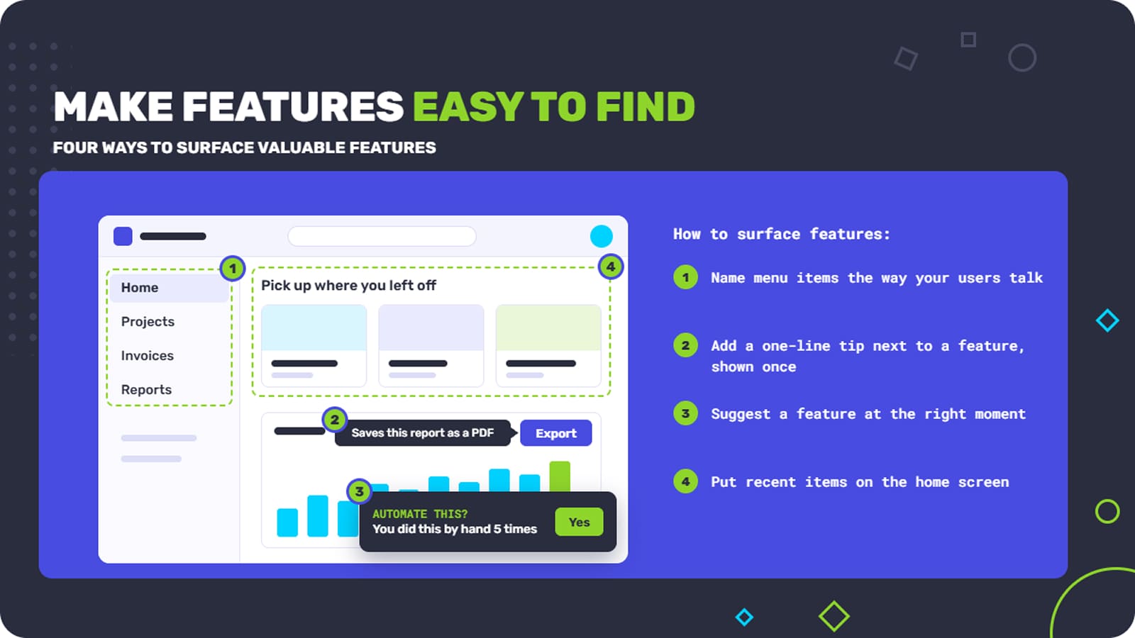
If you are not sure whether any of that is working, you need to take a look at the numbers. Track discovery, which is how many people see or open the feature, and check how many keep using it. Make sure you see how many people finish the task and keep using the feature in the long term.
If discovery goes up, that is good, but it should be followed by adoption. Knowing that helps you improve user engagement in a way that is actually helpful.
Fix or Remove Issues that Lead to User Drop-Off
To find out why people leave, start with your analytics. The funnel report tells you at which step most people drop out. Cohort data adds the timing: whether users disappear after a day, a week or a month. Then go through session recordings, survey answers and support tickets from that point. That’s usually where you see what went wrong.
What is very telling is the last thing that happened before your users left. It might be the last screen they saw, an error, a slow load, or anything we have already discussed.
People leave for different reasons, and each one needs a different fix:
| Reason | What you’ll see | What usually helps |
|---|---|---|
| Usability problem | People try a task they want to do and fail | Simplify the flow, make labels and feedback clearer |
| Wrong expectations | People finish the task but leave after seeing the result | Make marketing and onboarding match what the product really does |
| Missing feature | People ask for something the product can’t do | Consider adding it |
| Technical problem | Drop-off is concentrated on one device, browser or app version | Fix the bug or the slowdown |
| Outside factors | Price, season or a competitor’s launch | Deal with it outside the product |
Simplifying a workflow does nothing for people who need a feature you don’t have. Adding a feature does nothing for people who can’t find the ones you already have. Matching each fix to its cause is the heart of user journey optimization.
Once you have the list, rank it. Look at how serious each problem is, how many people it affects, how much it could change retention and how much work it takes. A big onboarding problem that hits most new users comes before a cosmetic issue in an advanced feature. Test the most important changes before you roll them out to everyone, with an A/B test or a release to a small group. If the change works, you’ll know. If it doesn’t, the test protects your app user retention.
Measure Engagement and Retention Improvements
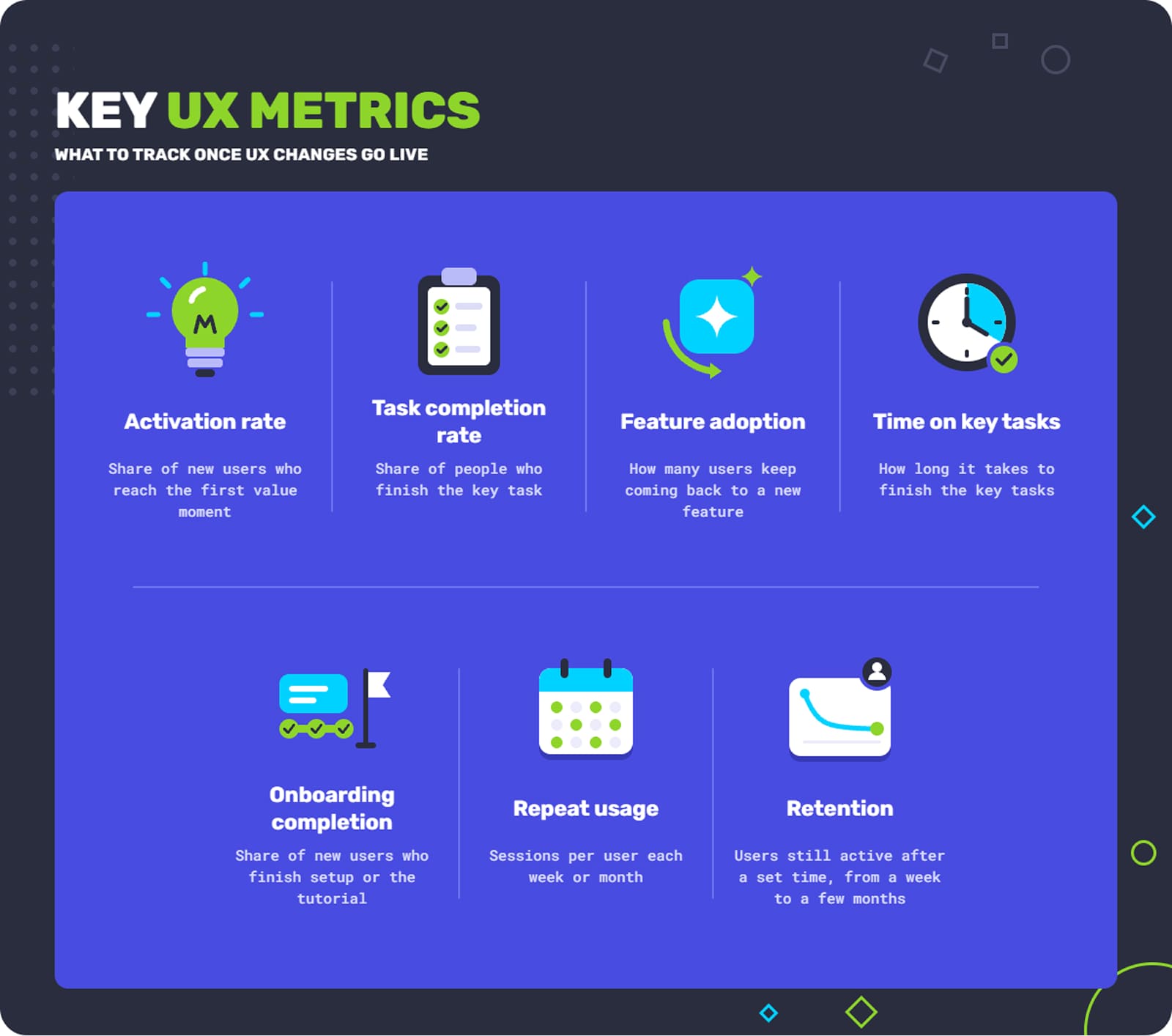
UX improvements cannot be judged properly unless you have clear success metrics. Sure, you can always change what looked bad to something better, but it has to perform a function. User experience optimization is impossible without them.
Pick the numbers before you start, and tie each one to the problem you’re trying to solve. Here are a few that you might find useful:
- Activation rate: you can tie it to the first value moment and how many people reach it.
- Task completion rate: count people who finished the key task.
- Feature adoption: you introduced a new feature and now you need to know how many people keep returning to it.
- Time on key tasks: how much time it takes to finish the key tasks.
- Onboarding completion: how many new users finish setup or the tutorial.
- Repeat usage: how many sessions each user has per week or month.
- Retention: how many users are still active after a set period, from one week to a few months.
Choose the numbers that fit what your product is for. Product optimization is not the same for software products, where you need people to finish certain tasks, and for games, where you want to see tutorial completion and players simply returning to the game.
Before you make any changes, introduce a baseline to judge everything you do later in terms of efficiency. Compare your starting numbers with the numbers afterward, over a period of the same length. When you can, run a controlled test, so you know the change caused the difference and not the season or a marketing push.
Yet some consequences can be completely unintentional, and you have to watch for those too. You can easily make onboarding shorter but leave users still unprepared to use the product, if it is something complex.
Tip: Before making a change, collect at least two weeks of data. Your starting numbers should include weekdays and weekends.
How Fgfactory Provides UX and Product Improvements
Fgfactory’s expertise is rooted in years of experience, but our UX consulting and product optimization services are not what you might expect. We have built a structured approach to evaluating digital products and, as a result, we use a painstaking method of finding and implementing practical improvements.
Our idea is comprehensive: we don’t want to improve a part of your digital product or a game without connecting it to a bigger picture. We take business goals, practical user needs, and product workflows that you have already worked on, and then we look at the engagement goals your business has at the moment.
As we’ve seen many times, such an approach allows us to support a whole lot of products, including new and existing software, applications from various industries and intended to deliver completely different user experiences, and games.
For new products, we start by reviewing planned user journeys, look carefully at wireframes and see if design decisions can be improved. When it comes to products that are already on the market, as part of the assessment, we examine user behavior, possible interface issues or places where the interface gives users reasons to drop off, and we study your workflows.
Step 1: Understanding Business Goals and Existing Processes
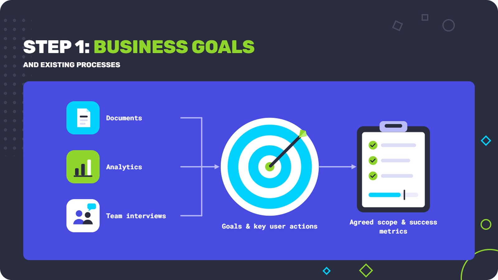
Our process starts with everything that defines and affects the product. First of all, it is business objectives, target audience, and the requirements the business needs to function properly. We also examine performance challenges.
We go through your documents and analytics and talk to the people who own the product, build it and support its users.
Together, we pick the key things users need to do and the business results they lead to. The focus might be getting more new users through onboarding or something more basic like making one important task easier.
Ultimately, we want to discover real problems. As a result, we have an agreed scope, a list of key user actions and the numbers we’ll use to judge success.
Step 2: Audit User Journeys and UX/UI Designs
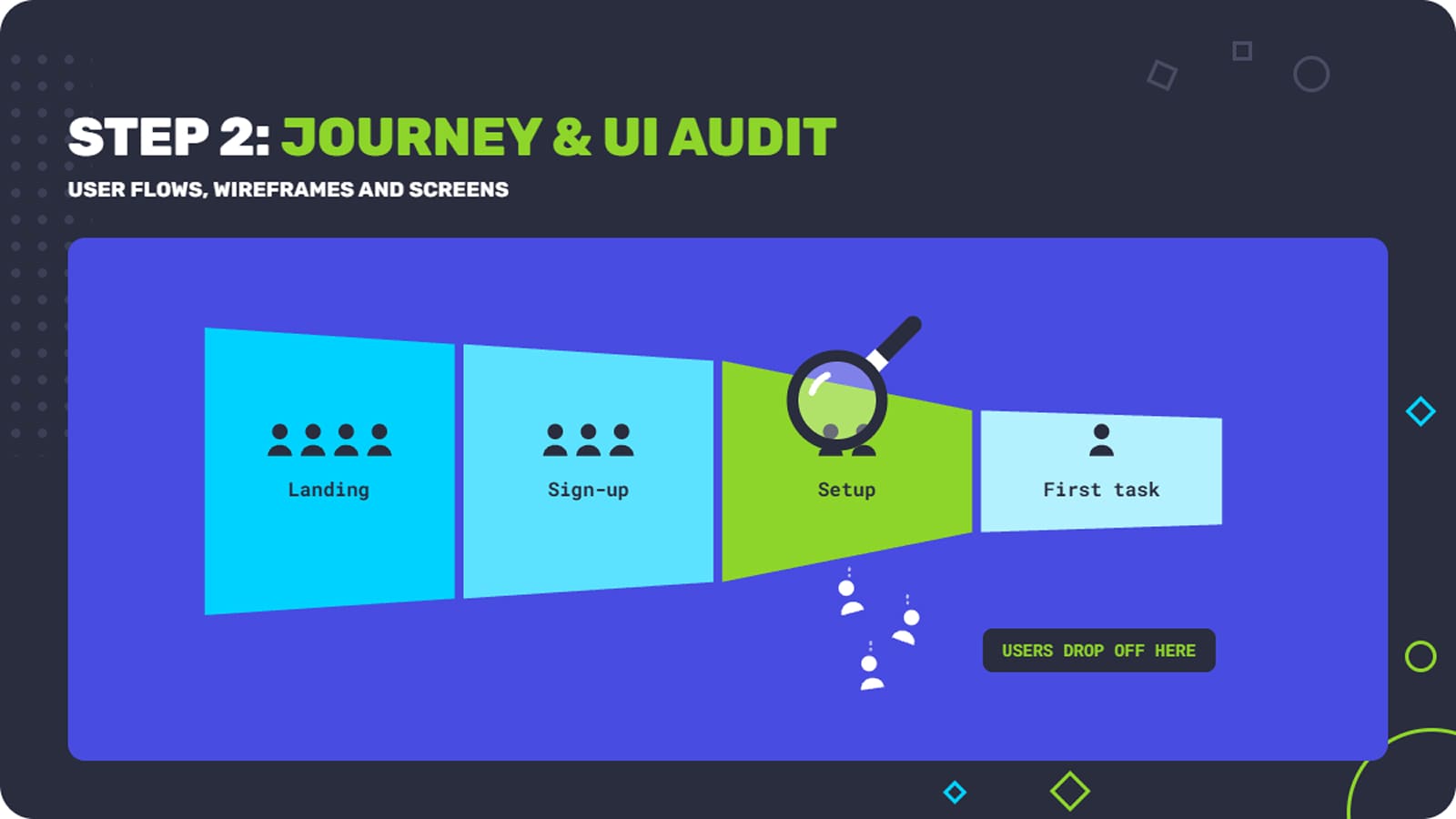
We go through the relevant user flows, wireframes, screens, interactions and engagement features in order to find where people might drop off or simply get stopped due to poor app infrastructure.
We connect what we see on screens to the whole of the user journey. We check whether each engagement feature supports what the product does really well.
Each finding is tied to what users need and what the business needs, so your team understands what can get better and why it matters.
Step 3: Prioritization of Digital Product Improvement Opportunities
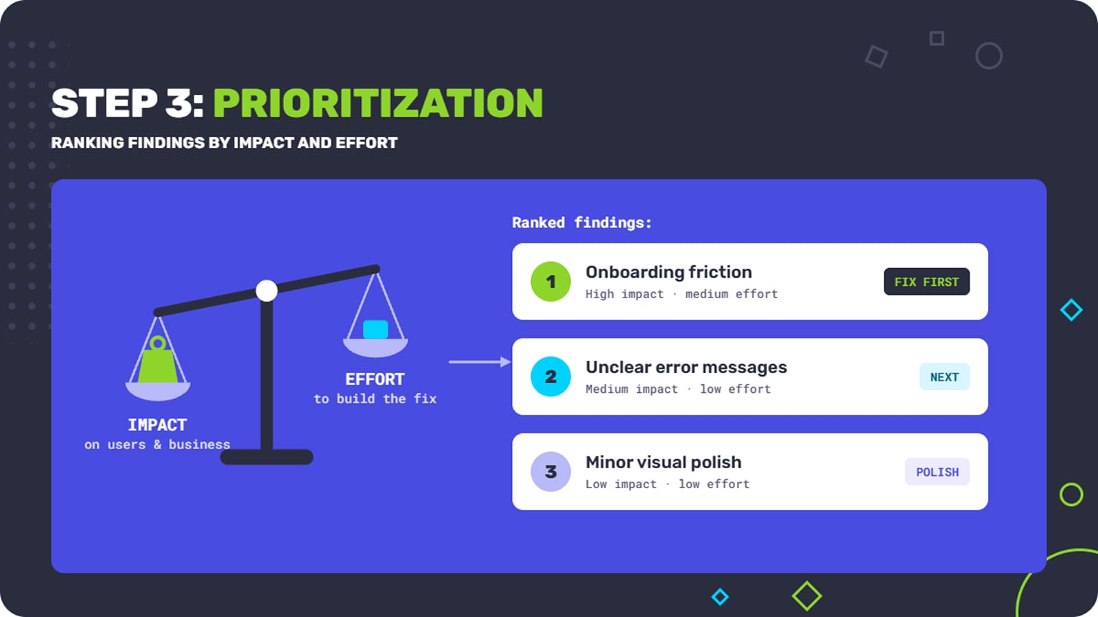
Next, we create a ranked list based on all the findings that we have. We rate each issue by its impact on users and by how strongly it affects the business. We also look at how serious and how common it is, how much work the fix takes and how strong the evidence is.
We distinguish bigger issues, for example friction in onboarding, from smaller ones that require a little polishing or minor fixes. We also consider the current state of your product and what is limiting it now, as well as your team’s capacity.
Step 4: Deliver Actionable Recommendations and Documentation
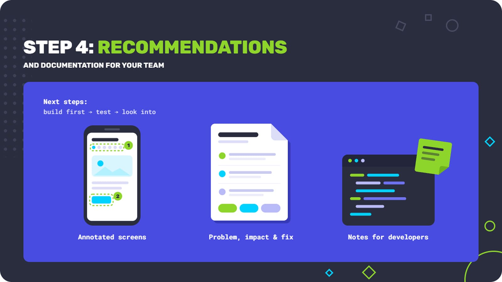
We provide a list of our insights and findings to product owners, designers and developers. We make it ready to use, describing the problem, how it affects the user’s path and how it can be solved.
We can also make it more illustrative with annotated screenshots and notes for developers, but that really depends on the project, because it won’t fit every single one.
The recommendations end with clear next steps: what to build first, what to test and what to look into further. That way your team can optimize user experience in a sensible order instead of chasing the loudest complaint.
Step 5: Checking Results and Identifying Next Steps
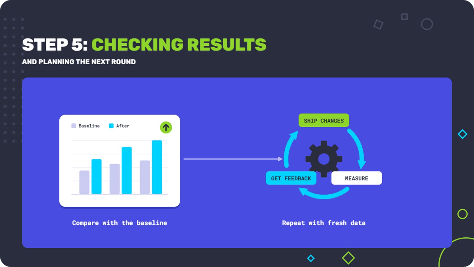
Finally, once the changes are live, it is time to check whether they fix the original problem and, if so, whether they do it effectively. This is the time to compare the numbers you agreed on in Step 1 with your starting point, and get even more feedback.
Improvement is an iterative process. Once you change something about the problem, check the result and repeat, because in the next cycle you can get more data that is valuable at the current moment. That’s how we approach UX optimization at Fgfactory, and it allows businesses to evolve all the time.
Conclusion
People keep using products that are engaging and do not demand too much. They leave because of unnecessary overcomplications and overstretched processes.
A structured approach to user experience optimization is effective because it covers everything there is to cover. You see the real problems your users face and fix them.
Fgfactory provides UX consulting and UX optimization for new and existing apps, software and games. As we described, our approach is comprehensive, so we spot every single problem and work on them to find the best possible solution. If you want to improve user experience and get more users to return and stay with your product, we can offer a custom approach for your specific industry.
Ready to improve your product’s user experience and retention? Get a free consultation.

 Loading...


